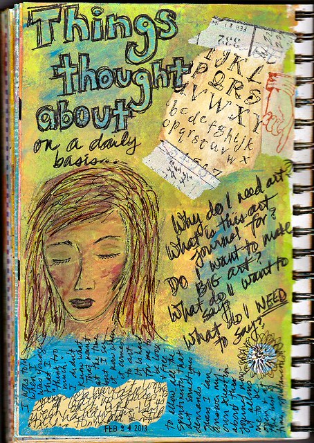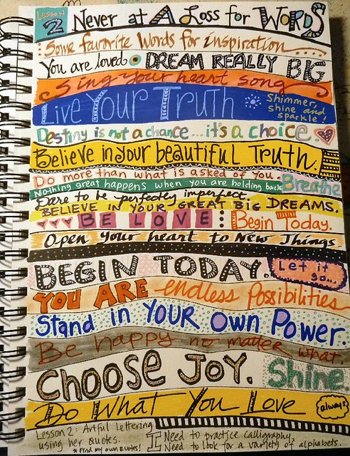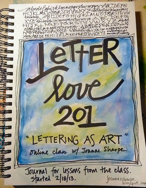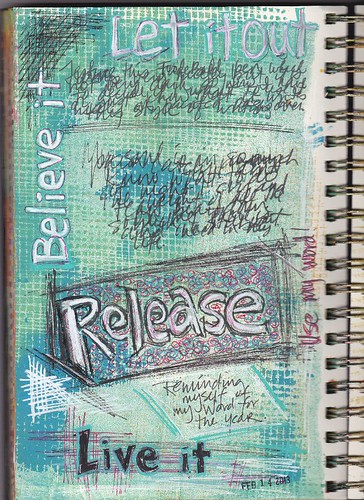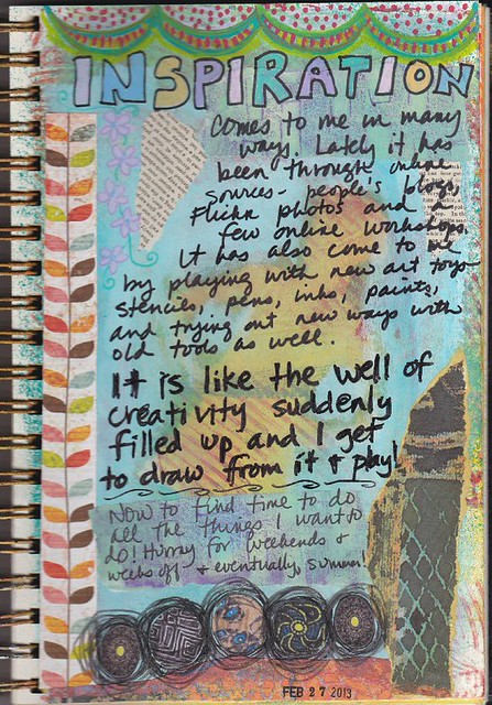
The ones on the top are both Prismacolor -- so nice and dark! The bottom one is the FudeBall 1.5 I got from Jet Pens. It looks so washed out compared to the Prismacolors. Collaged elements and stencils on a gelli printed background.
Looking at it now I wish I had done more with the lettering -- after all I am taking a lettering class! But I wrote it quickly while the thought was on my mind and didn't worry about the writing. Eventually I hope to learn how to slow down (I can always jot down my thought on a scrap and rewrite it nicely later)... eventually.

